Natural Products Packaging: Cutting Through the Clutter
How do you design packaging to stand out on a crowded shelf?
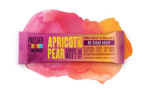
Photo from KIND

One could reasonably argue that natural-product branding, including packaging, is almost more important than the product itself-at least initially. The sheer volume of functional-food and -beverage products, nutritional supplements, and other natural wellness products vying for consumer attention and dollars online and on retail shelves requires brands to be deliberate and innovative in their branding and packaging strategies. The risks of not doing so include losing customers to brands that more effectively attract, relate to, and engage with them. In fact, a poorly branded natural product may remain completely unknown.
Indeed, when branding and packaging a functional food, a functional beverage, or a nutritional supplement, hastiness, corner-cutting, unimaginative thinking, and ignorance of the target customer will save the company a few bucks early on but will likely prove disastrous later within the ultracompetitive retail market. Fortunately, an understanding of the significance of effective branding, along with the foresight and willingness to allocate ample time and resources to it, can assist a product in cutting through the clutter of similar products and earning the attention and loyalty of customers.
Branding 101: Above All Else, Know Your Customer
Packaging is one element of the overall branding strategy, and when developing that strategy, consumer research matters. “Functional-food and nutritional-supplement brands should be based on an understanding of a core or target consumer,” says Clark Goolsby, vice president, creative director, Chase Design Group (New York). “Learning their needs and what attracts them is the result of good research.” This research includes convening focus groups and conducting online surveys to target customer feedback, says Jeff Hilton, cofounder and chief marketing officer of BrandHive (Salt Lake City), as well as “tapping into” existing secondary research that illuminates generational preferences and category usage trends. Plus, Hilton adds, “talking to your retail accounts and sales brokers will provide insights” that might otherwise go undiscovered.
Along with all of this research comes appropriate audience segmentation to aid in shaping and fine-tuning the branding approach. “In today’s consumer marketplace,” Hilton warns, “it is all about segmenting your audience. Trying to speak to too many audiences is a common problem. Usually you end up talking to no one.”
Aligning Package to Brand
An understanding of the customer and a segmentation of audience will help guide the branding strategy and overall message, a component of which is the packaging of the product. “The packaging is an expression of the brand, just like your physical body is an expression of your soul or essence,” asserts Yadim Medore, founder and CEO of Pure Branding (Northampton, MA). “If the packaging isn’t in alignment with that essence, there will be a major disconnect between what the brand stands for and the meaning conveyed at shelf,” and the product will be overlooked, he says.
Medore points to his company’s work with herbal-supplement brand Gaia Herbs as an example of how brand and packaging can be brought into harmony. “When Gaia Herbs came to us, their core brand message wasn’t clear and didn’t foster a connection with consumers or inspire retail staff to recommend their products. And you could see that with the packaging. It was a mishmash of designs and messaging.” Pure Branding and Gaia Herbs worked together to create the Meet Your Herbs campaign, comprising a traceability program and opportunities for further consumer engagement. As part of this rebranding effort, Pure helped organize Gaia’s extensive product offering into four lines based on the “four distinct need states” in which people shop for herbal supplements, Medore explains, to get “the right herb to the right person at the right time.” The rebrand included a new logo “designed to invite brand-name recognition” and new packaging that “celebrates Gaia’s clinical and consistent nature while answering ‘What’s in it and what will it do for me?’ on the front of every package.” The “Meet Your Herbs” and “Plant Intelligence” taglines appear on each Gaia Herbs package, too. Medore says these packaging elements work together to create a “memorable” impression on the target customer in that “anyone looking for Gaia Herbs on the shelf knows exactly what to look for,” and he says Gaia’s packaging as a whole offers “extreme clarity” and opportunity for further engagement.
Packaging company Nosco (Gurnee, IL) shares Pure Branding’s philosophy that branding and packaging should align, particularly for natural products, and that the two must work together to convey a clear message to a target consumer.
“Packaging is the billboard that sells your messaging,” Nosco’s packaging advisor, Brent Anderson, says. “It should communicate clearly and consistently, and align with the message of the rest of your marketing materials.” As for designing packaging specifically for natural-health products, Anderson succinctly states: “Super-cluttered is bad. Super-simple is good.” He also points to the importance of knowing one’s category and designing packaging accordingly. “One of the best examples of this,” Anderson explains, “is the difference between the sports-nutrition-supplements category and the vitamin-and-mineral-supplements category. Packaging for the former is often bright, vibrant, bold, and strong. It may incorporate metallic materials or textures.” On the other hand, he continues, vitamin and mineral packaging is “usually soft, comforting, reassuring, and more likely to contain recycled materials.” These differences are deliberate.
One particular category, fresh-pressed juice, provided inspiration for Chase Design Group’s branding and packaging of Pressed by KIND bars, a natural, nutritious snack food. Chase’s Goolsby says his firm leveraged the image of simplicity, healthfulness, and freshness evoked by many fresh-juice labels in its design of the Pressed by KIND packaging: “Many juice [brands] choose to simply use the color of the juice combined with typography to communicate their ingredient stories. We took a similar approach. By using the vibrant colors of the ingredients themselves, subtle textures, and hand-drawn typography, we were able to communicate the great ingredients within each bar.”
For product-line and branding consistency, Chase Design Group made sure it incorporated KIND’s recognizable grid-based packaging layouts into the packaging of the new bars.
Natural Product Packaging: What’s Working Right Now
Not surprisingly, specific trends in natural product packaging currently center on the concepts of cleanliness and simplicity. Nosco’s Anderson lists clean labels, clear packaging, and transparent packaging among these.
BrandHive’s Hilton points to the strategic use of white space, which happens to be evident in Pure’s rebrand of Gaia Herbs. Hilton also notes the use of form and function differentiation, particularly through unique delivery formats, such as sprays, shot bottles, and squeeze pouches.
Packaging that provides opportunities for customer engagement is also key and is cited by brands and marketing companies alike. QR codes, expanded labels, and hang tags all “interrupt the retail experience” for the customer in a good way, Hilton explains, by inviting a deeper dive into the brand.
Packaging for Online Sales
One cannot discuss branding and packaging of supplements and functional foods/beverages without considering the various sales channels-particularly online storefronts. While no manufacturer, brand, or marketer would dispute the significance of Internet-based presentation, sales, and customer engagement, different philosophies do exist in how to approach online versus brick-and-mortar marketing.
On one hand, Pure Branding’s Medore points out that channel boundaries “are more and more getting blurred” as products become almost equally available and accessible in both mainstream outlets and natural stores, and online. “More natural consumers spread their buying to multiple locations,” he says. “So think less about the channel and more about who the brand participants are that you are targeting. They may cross channels, but that does not change who they are and what they are looking for.”
He does add that brands should “think about all packaging as being online, only a click away from more information.”
On the other hand, Chase Design Group’s Goolsby believes that shopping for natural products online is a “very different experience” than shopping in a traditional retail outlet, and that brands need to understand how consumers encounter and interact with products online. “Packaging designs need to be engaging at thumbnail scale,” he points out.
Nosco’s Anderson adds that, online, “decorative features aren’t as important. They become more so when you are touching the product.” Online, he explains, the consumer has fewer senses with which to work. That consumer can’t physically touch the packaging, he points out, so “unique structures, soft touch, and metallic or shimmer are not necessarily conveyed well.” However, Anderson adds, online, brands have “complete control over how they and their products are represented. You’re limitless when it comes to creative graphic elements and shapes, which is important because customers need to remember the package and want to buy it again.”
In a brick-and-mortar store, he says, brands are limited to certain structural designs that will work well on a shelf and “what’s allotted to them in a plan-o-gram.” Additionally, retail is more competitive, Anderson asserts, and brands don’t have control over lighting, shelving color, “or even who their neighbors are.”
A Word About Science
For natural products, science and substantiation are relevant and worthy of addressing in branding and, by extension, packaging; however, beware of prioritizing them above all else. “This is the number-one trap we see brands in this space fall into,” Pure Branding’s Medore states. “Every brand we’ve ever worked with claims they have the best science. And that may be true, but for the consumer it’s just noise.” He further explains that science serves an important purpose in “credentialing. It needs to be there and validates the decision to participate with a brand. But it is not a compelling differentiator that gets me to participate,” he explains. His perspective is that science and quality are “costs of entry,” and viewing them as more than that is unwise. What matters most, he continues, is the emotional connection you can make about who you are as a brand and the “why” of what you’re doing. “Lead with the passion, support it with science,” he asserts.
Likewise, Anderson of Nosco says that “first and foremost, it’s important to focus your messaging on your customer.” He does recommend marketing a product’s special differentiators, if any, but overall, “you want to clearly convey your value proposition with your packaging, labeling, and marketing,” he advises.
Also read:
Is Compostable Packaging the Next Step in Sustainability?
Best Seller: Telling a Brand's Story though Dietary Supplement Package Design
Suing over Empty Space: Why Lawsuits over Slack Fill in Packaging Are Growing

Prinova acquires Aplinova to further increase its footprint in Latin America
April 7th 2025Prinova has recently announced the acquisition of Brazilian ingredients distributor Aplinova, which is a provider of specialty ingredients for a range of market segments that include food, beverage, supplements, and personal care.


