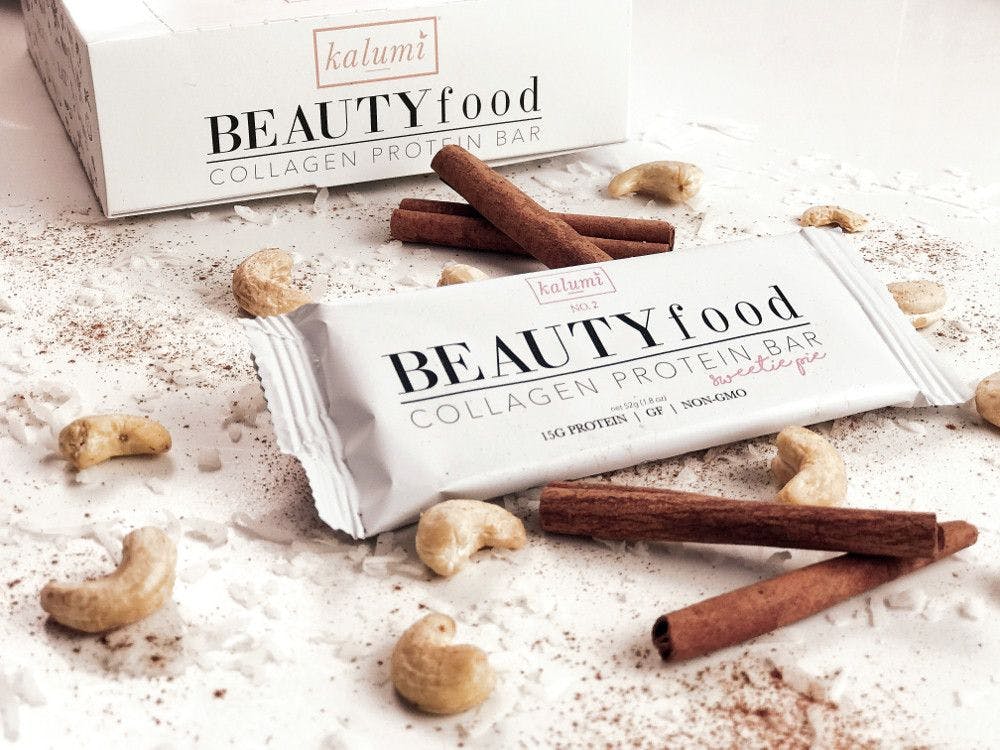
Natural product packaging trends and strategies
As more wellness products enter an already crowded market, packaging remains paramount to marketing and branding efforts.
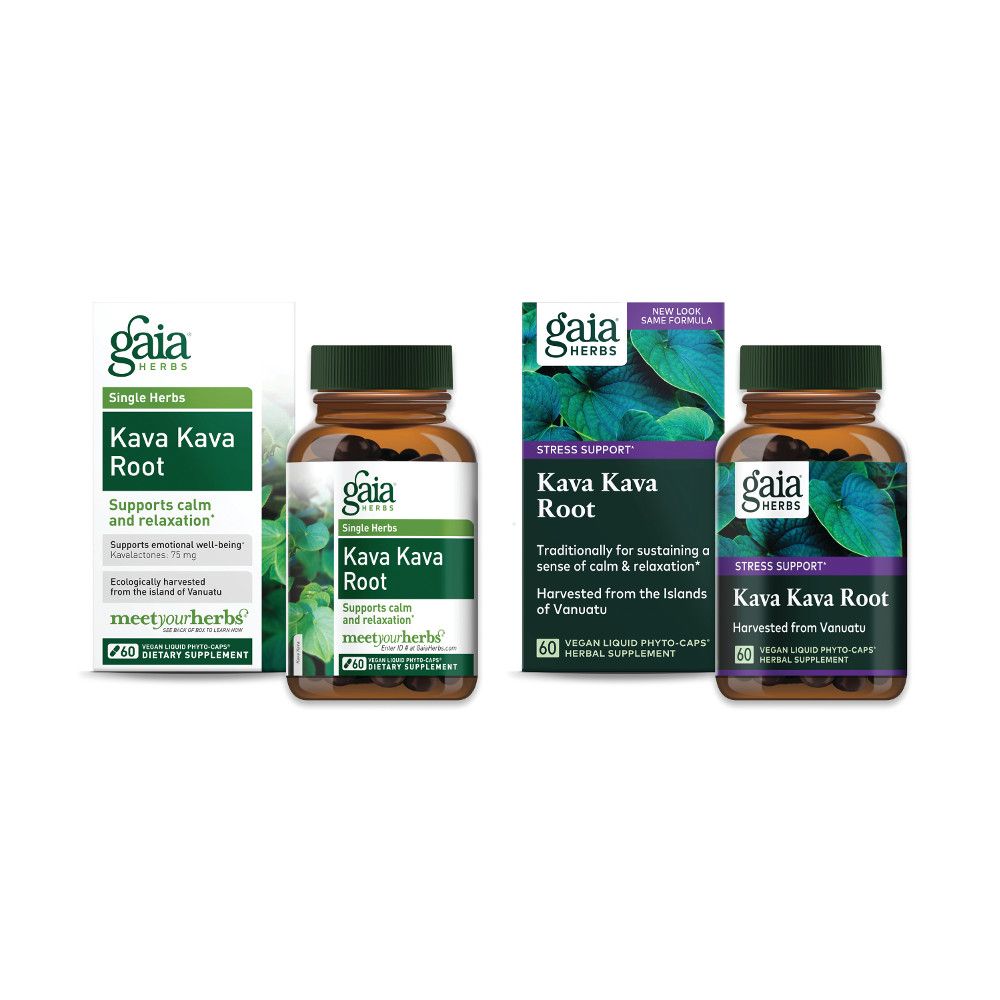
Gaia Herbs unveiled its redesigned packaging at the Natural Products Expo West trade show this March. The company’s in-house designers put greater emphasis on the products’ heroes—the herbs—with “beautiful, close-up images” of the herbs on the product labels. This photo shows the original packaging at left and the redesigned packaging at right. Photo from Gaia Herbs
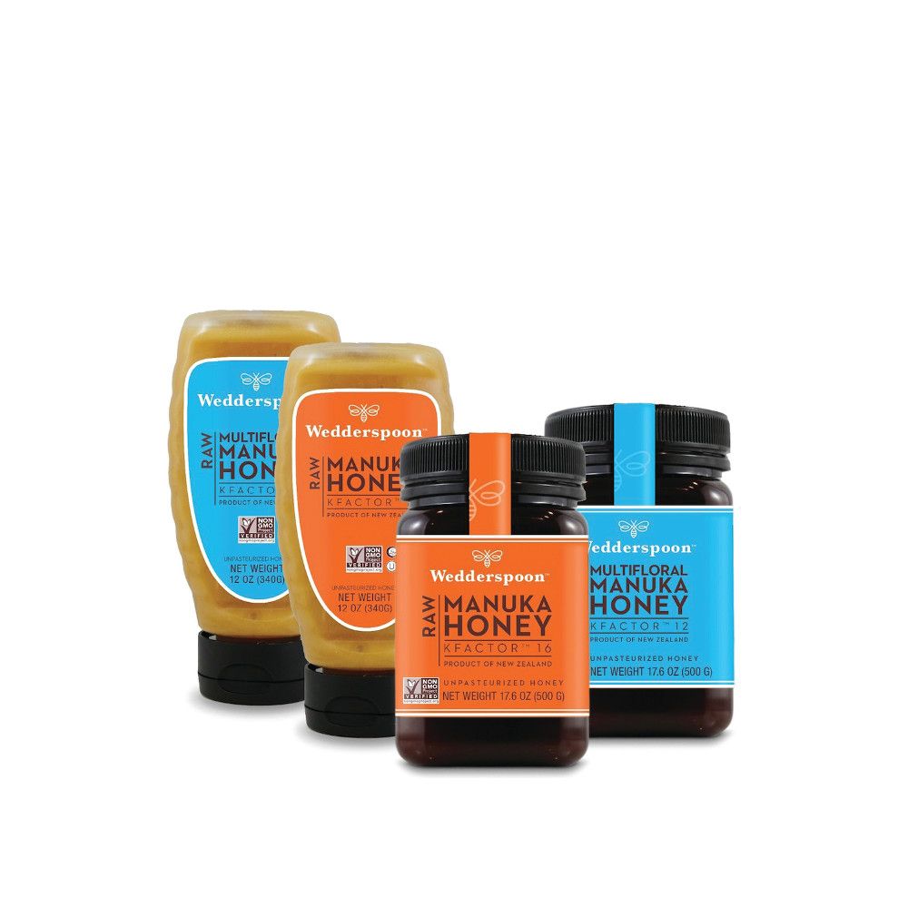
Click to enlarge: When Wedderspoon embarked on a rebrand for its number-one-selling Manuka Honey brand in North America, it wanted to emphasize how the brand stands out in the market.
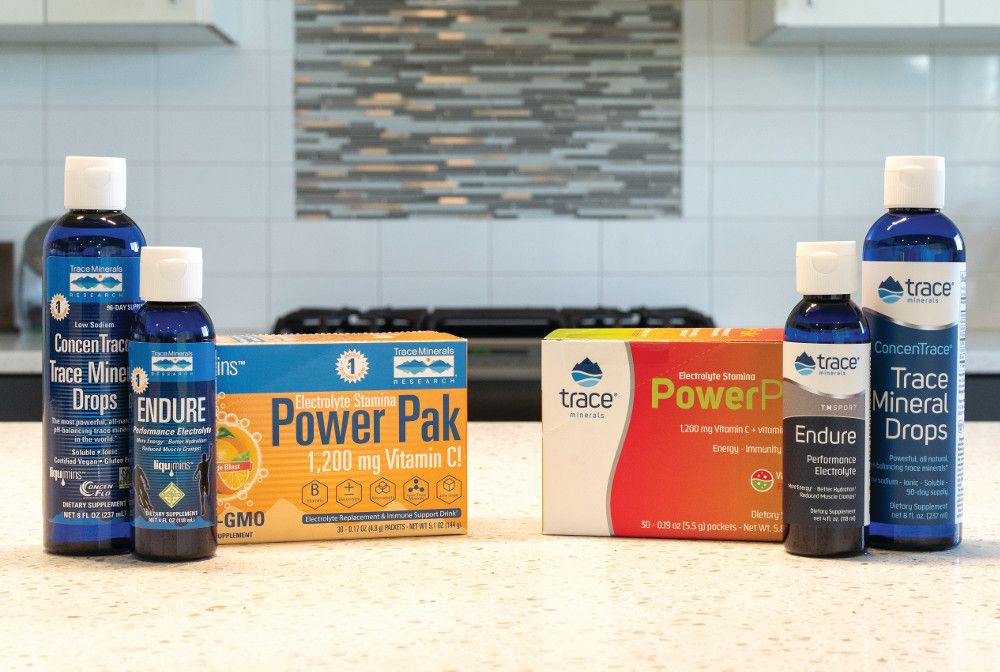
Click to enlarge: Last year, Trace Minerals redesigned its packaging to appeal to young and active consumers.
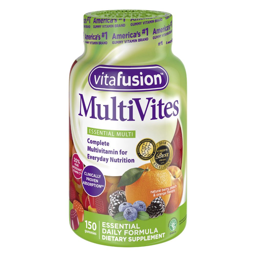
Click to enlarge: Vitafusion announced last year that it is the first vitamin brand to convert to recycle-friendly shrink packaging in the United States.
As more wellness products enter an already crowded market, packaging remains paramount to marketing and branding efforts. Indeed, with packaging of these products continually evolving in a highly competitive atmosphere, one would be forgiven for wondering if there is anything new under the sun.
It seems that the answer is yes, there is, and the more wildly different and potentially disruptive, the better. “I believe what brands are looking for and what they need are two different things this year,” says Kevin Smith of Smashbrand, a packaging design and branding agency serving the natural products industry. He explains: “We get several calls a day with brands looking to refresh with the same on-trend, millennial-friendly buzzwords, such as healthy, sustainable, trustworthy, clean, and the like. I believe we are hitting a saturation point on-shelf, where too many brands look alike.” This sameness, he says, creates confusion and hesitation on the part of the consumer. To drive home his point, he wryly asks, “Have you seen a kombucha section lately?!”
David Lemley, president and head of strategy at brand-strategy firm Retail Voodoo, agrees that products must use packaging to “stand out,” while also balancing that goal with category convention. “The package is often the first and only salesperson for a health food and for functional foods and beverages,” he says. “In each case, the packaging needs to work hard to deliver brand beyond functional features and benefits while simultaneously clearly communicating those attributes.” (See photo at top right of packaging for Wedderspoon, which is a Retail Voodoo client.)
Gaia Herbs Director of Brand Experience, Frederic Terral, who was involved in the latest rebranding of Gaia Herbs products, adds that successful packaging-design execution for natural products “encompasses deliberate and calculated typography choices and rich or unique colors,” and displays a “general sensitivity to purposeful compositions.” To “intimately control” the company’s brand messaging, Gaia has created an in-house agency called The Hive to align its “verbal and visual identity” with its culture, mission, vision, values, and persona. Via The Hive, Terral says, “We know our people, we know our customers, and we know best how to express our brand in the most sincere and genuine manner.”
How to Stand Out?
“It’s a tough market out there,” says Smashbrand’s Smith. “Nine out of ten new health and nutrition consumer products will fail within the first year. Usually, this has nothing to do with the product itself, only how it’s presented.” He reiterates that the majority of all first-contact and purchasing decisions are made “at the shelf” in retail locations. And for brands following distribution models, packaging is “the most critical marketing asset they have.”
2019 is the year brands “have a significant opportunity to be disruptive on the shelf,” Smith continues. “With so many brands competing for the same look and feel today, the landscape is ripe for smart competitors to take risks with strategic bolder design choices that can still tap into consumers’ shared values and beliefs.” Smith says he is beginning to see what he calls a “massive shift” in the industry, in which the riskier and more differentiated and disruptive concepts are outperforming the more-popular “on trend” ideas that brands say they want.
For Gaia Herbs’ rebrand, for which the company was seeking greater approachability and relatability among customers new to the brand and to herbal supplements in general, Terral began with a comprehensive three-month in-house brand audit, “complete with an anonymous questionnaire to stakeholders, a look into past and present branding strategies, an extensive competitive landscape study, and the creation of a dozen style and mood boards to gauge the collective aesthetic aligned with the leadership teams.” All packaging elements were carefully scrutinized.
The specific changes to Gaia’s packaging design included more-prominent macro herbs photography “to connect plants and people and to capture consumers’ eyes on shelves,” as well as a refined, more modern logo made clearly visible on the package. Gaia also replaced much of the white of the package art to nature-evoking greens.
Trace Minerals recently rebranded, too, and its marketing manager Scott Boyson says the company was seeking a “fresh new look” for the line, after ten years of the same packaging design. “Packaging was an important part of the rebrand,” Boyson says. “We did stay with our cobalt-blue bottles because we felt strongly that our consumers had identified our brand with that bottle, and we didn’t want to create any confusion since we knew we would be changing the logo and design.” The company understood that the blue bottle stood out on the retail shelf, so it left that one element alone. Instead, marketing and branding firm BrandHive-hired by Trace Minerals to lead the rebrand-simplified the front of the label, which had “gotten too busy with logos and other violators,” Boyson explains. BrandHive chose “clean,” updated fonts and bold colors, and a metallic “swoosh” to convey a premium look. Labels and boxes were switched from glossy to matte, and a soft-touch finish was applied to boxes as well. “We wanted consumers to see and feel that ours is different from other products, that it is higher quality than others on the shelf,” Boyson says.
Other Considerations
Retail Voodoo’s Lemley says that beyond the visual uniqueness and attractiveness of the packaging artwork, other packaging considerations include holistic sustainability, which he says includes everything from sourcing the packaging materials to discarding the empty container. He also points to an observed increase in the consumer’s desire for portability. “This could be a great opportunity for supplement, wellness, and functional-food brands willing to think about dosing as portion control and provide a sustainable answer to single use, travel size, etc.”
Trace Minerals’ Boyson calls his company’s rebrand one that pairs a “premium look” with environmental friendliness. “Almost all of our packaging is recyclable,” he says. “It is important to us to reduce our carbon footprint as much as possible.”
Alpha Packaging’s (St. Louis) vice president of marketing, Marny Bielefeldt, says her company is seeing increased requests for 100% post-consumer resins across a number of categories. “Sustainable packaging can reinforce a brand’s commitment to the environment and to clean ingredients,” she says. “We find that the companies that value recycled plastic most are those companies making commitments to sustainable practices across many areas of their business. Alpha makes bottles in food-safe PET or HDPE post-consumer resin for all the industries we serve.”
Compliance with labeling regulations is a consideration cited by Gaia’s Terral. “We follow the guidelines set by FDA with diligence and compliance,” he states. “We go above and beyond to grow and source the cleanest ingredients possible. We screen our ingredients at our Gaia Lab in Brevard, North Carolina, and we share the results online in our meetyourherbs.com traceability platform.
“The challenge in creating packaging for nutritional supplements,” he continues, “is to work within the strict confines of a highly regulated industry. Others may make claims on their packaging that we deliberately choose not to make. We do so for the sole purpose of not only ensuring FDA compliance but also to affirm with our customers our commitment to operating a business with integrity, confidence, and conviction.”
Sidebar:
Taking Recyclability to the Next Level
Vitafusion announced last year that it is the first vitamin brand to convert to recycle-friendly shrink packaging in the United States. Its MultiVites 150-count gummies bottle was already recyclable, but the seamed, shrink-wrapped label wasn’t. Beginning last year, however, packaging for Vitafusion MultiVites 150-count gummies now incorporates shrink labels made with Eastman Embrace LV resin and Sun Chemical’s SunLam Deseaming adhesive-a move that converts a previously only partially recyclable gummies package to a fully recyclable one.
“We are committed to making a positive impact on the environment,” a Vitafusion spokesperson said in an e-mail message to Nutritional Outlook. “Our partnership with The Fruit Tree Planting Foundation to plant up to 200,000 fruit trees by the end of 2020 has continued to inspire us to be better and do better, and we knew this was the clear next step.”
The full Vitafusion gummies line will convert to recycle-friendly shrink-labeled packaging within 2019, the company says.

Prinova acquires Aplinova to further increase its footprint in Latin America
April 7th 2025Prinova has recently announced the acquisition of Brazilian ingredients distributor Aplinova, which is a provider of specialty ingredients for a range of market segments that include food, beverage, supplements, and personal care.

.png&w=3840&q=75)

.png&w=3840&q=75)


.png&w=3840&q=75)


.png&w=3840&q=75)

