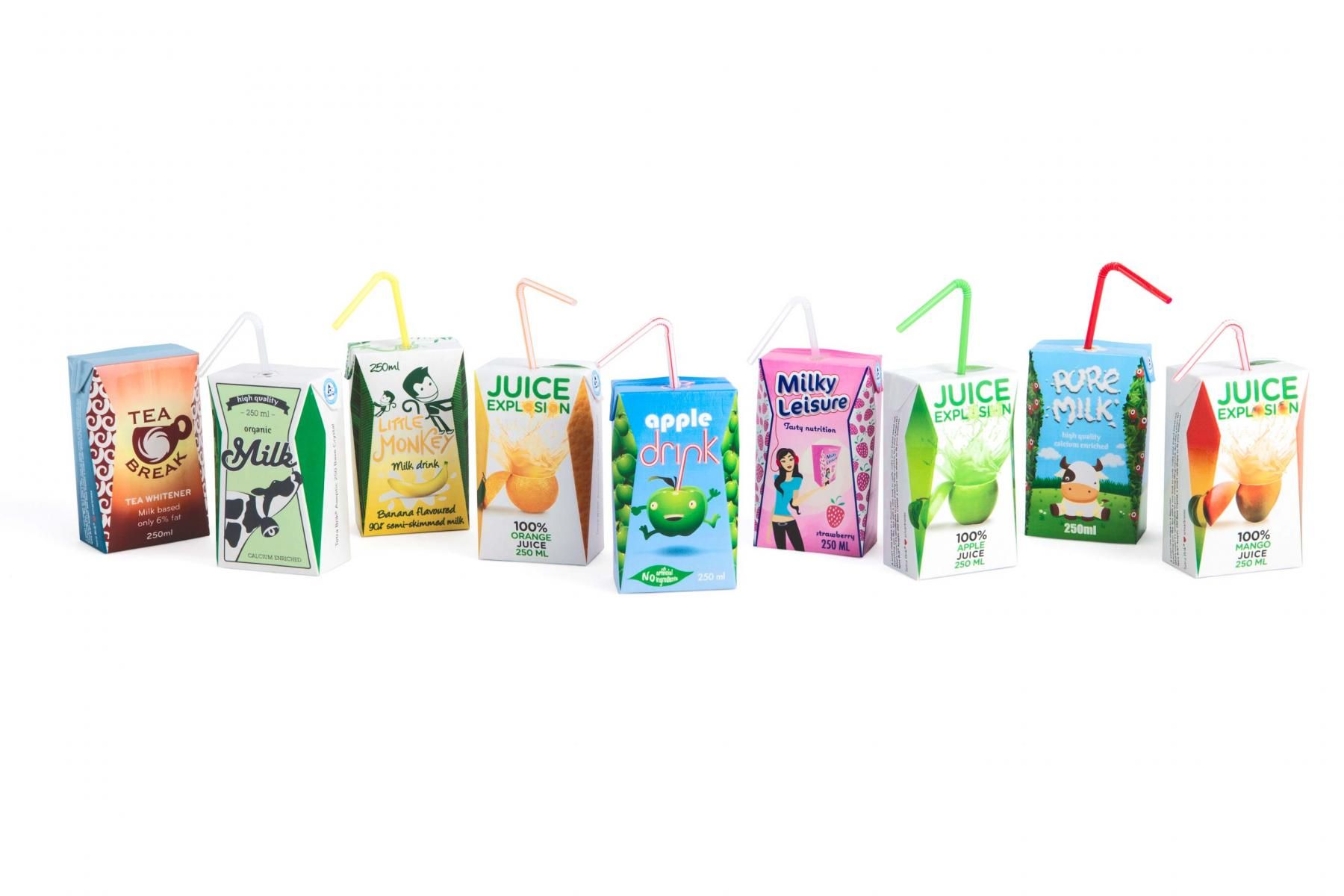
Tetra Pak Juice Box Offers More Graphic Design Space
Gone are the days of box-shaped juice and dairy cartons.

Despite their convenience, juice boxes and dairy boxes are quite limited in design options. Their square-ish shapes offer six separate panels for design and labeling, but only the front panel is immediately visible to the busy shopper.
It’s 2014 now, so Tetra Pak is modifying its Tetra Brik Aseptic 250 box by adding crystal sides. Unlike conventional flat-sided packages, the Tetra Brik Aseptic 250 Base Crystal pops those sides out, giving graphic designers a whole new design space to work with. (Check out the examples in this picture.)
Tetra Pak gave its design the green light after successful field tests with Chinese dairy producer Mengniu. Mengniu head of brand management Zhao Xingji said the innovation gave his company “a simple way to support the upgrade of our dairy drinks products.” The package option will now be available worldwide.
Beyond visual appeal, the new package is differentiated by increased stiffness and, by the looks of it, greater hand comfort. Tetra Pak even says the crystal option uses a higher paper content, thereby increasing renewability.
Thankfully, the crystal package is retrofittable on the company’s existing TBA/22 filling lines. New and complementary A3/Speed lines will be available in 2015.


